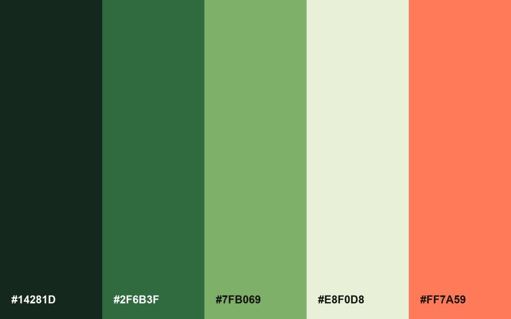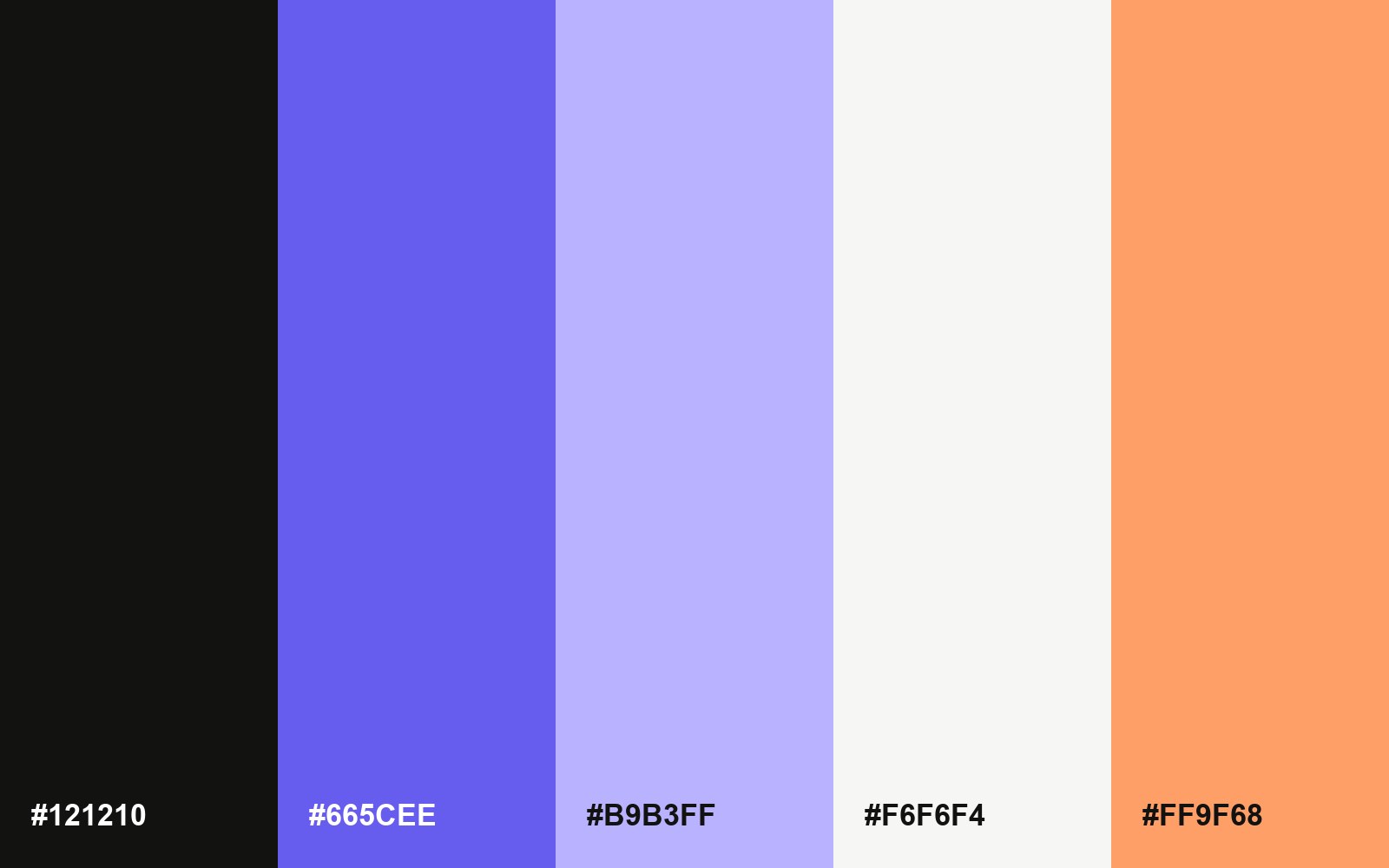
A brand palette is a short list of colors you use everywhere: on your site, in your posts, on packaging and on social media. Picking one is less about taste than about a few practical checks.
Start with one color you already own
Most brands already have a color people connect with them, from a logo, a storefront or a product. Start there, and build the rest around it instead of starting from a blank wheel.
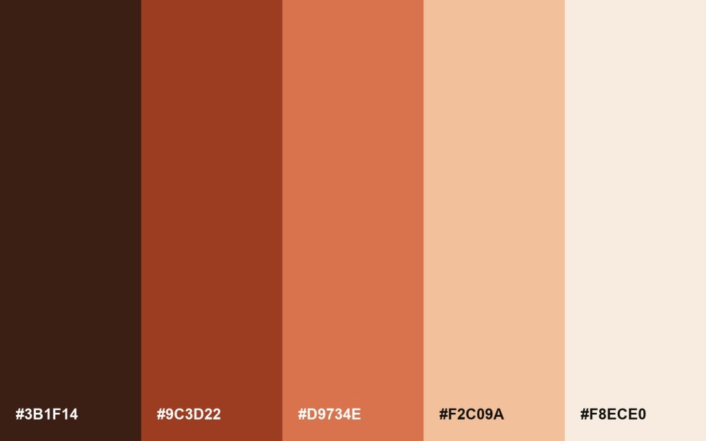
Add a dark, a light and one accent
A working palette needs a dark color for text, a light one for backgrounds, and one accent for buttons and links. Two or three more are optional, for charts and illustrations.
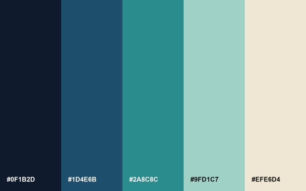
Check contrast before anything else
Text has to stay readable on your background. Aim for a contrast ratio of at least 4.5 to 1 for body text, and check your accent on both the light and the dark color.
Write it down
Save the hex codes in one place your whole team can find, with a line about where each color goes. A palette nobody can find is a palette nobody uses.